

UX DESIGN CONSULTANT
Client: Create The Remarkable - B2B2C Media Production
Responsive Web Redesign
Spring | Summer 2020
ROleS
UX Researcher & Designer
UX Writer
TOOLS
Calendly, Zoom, Miro, Notion, LucidChart, Google Forms, Google Slides, Square Space
METHODS
Stakeholder Interviews,
Task Flows, Competitive Analysis,
User Interviews, Affinity Maps, Persona, Design Studio,
Paper Sketching, Usability Testing, Style Guide, Content Writing
TIMELINE
3 Months
SUMMARY
Using a research-first approach, I designed a responsive website for Create The Remarkable, a M/WBE-owned media production company based in Brooklyn, NY that creates video & photography content for social-impact organizations.
My biggest takeaway was how vital it was to the user experience to strengthen the brand narrative by providing better clarity, credibility, and context, in conjunction with their showcasing their services and products. There was a rich story missing!
Using SquareSpace as a hosting platform, I removed all template presets and designed using a blank canvas. By including new navigation, clearer information hierarchy & taxonomy, new copy, a new style guide, and introducing interactions, I made it much easier for users to understand the story of the brand.
Traffic on the redesigned site increased by 34% in the first 60 days after launch, and user testing showed a 150% increase in user satisfaction, 66% increase in ease-of-use, and indicated new users were 60% more likely to reach out to the business.
PREVIEW THE REDESIGN
Watch a short walk-through of the redesigned website.
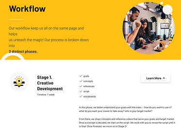
HOMEPAGE : HIGHLIGHTS
All content on the original website existed on a single scrolling homepage with a hero video at the top, and duplicate pages built into the navigation tabs. A cleaner homepage uses an updated hero video, white space and sections with headers to give users a preview of what else they should expect to find on the site, with obvious CTAS buttons and navigation tabs to take them there.
.png)
Homepage - BEFORE

Homepage - AFTER
UNDERSTANDING
THE BUSINESS
ARTICHOKES, RAPPERS, and $1 BILLS: CONTENT WITHOUT CONTEXT
I started my work for this redesign project with a scored heuristic evaluation of the existing desktop site to familiarize myself with the business, and gain a qualitative and quantitative understanding of what the experience of the current website is like from the perspective of a prospective client (the user).

Despite an interesting banner video on the top of the homepage, it wasn't immediately clear what the brand did based on the content and organization. The video had no clear context, the text overlay was hard to read and blocked the video, and the entire website existed on a single anchor page.
The site initially earned a good score for credibility, trust, and brand value by listing their notable clients, but findability was compromised, as the list was buried in the "About" section making up a visually dense block of text at the fold.
Credibility of the creative team was also diminished by use of an unclear, partial headshot.
Based on the absence of labeling, unclear taxonomy, and wide variety of images making up the site's current portfolio content, the evaluation also pointed to high potential for confusion and unclear expectations about the types of clients the brand typically works with, who the content meant for, or what purpose it serves.
As a production company providing both a service and a product to non-profits and government agencies, the evaluation showed that while users could see examples of finished media products, they were not able to find information on any technical production services.
For a brand with "Remarkable" in their name, my experience was rather...unremarkable.


KEY TAKEAWAYS
According to best practices and heuristic scoring, users were likely to lack significant context when visiting Create The Remarkable's website, but to find out if this was true, I conducted a round of baseline usability tests.
CAN USERS COMPLETE BASIC TASKS?
To evaluate how the website's usability fared for real users, I tested 3 users in a scenario and set of 4 tasks developed to validate or invalidate my assumptions from my heuristic evaluation.
Insights from testing confirmed that:
users are unclear on brand story, target audience, and final product
services, brand credibility, and specific examples of work are difficult or impossible to find
"It's emotionally promising, but I don't know what I'm looking at, or what they do." - User feedback
TASK SUCCESS RATE:
SATISFACTION:
EASE OF USE:
LIKELIHOOD OF
CONTACTING
THE BRAND:
25%
2/5
3/5
2/5


ORIGINAL SITE TASK FLOW:
The endless loop of searching for a specific video

KEY TAKEAWAYS
My heuristic evaluation and usability testing indicated that changes to the information architecture, labeling, titling and copy, and designing a more cohesive visual & written narrative would improve the user experience. But before I could start designing, it was important to talk directly to stakeholders as part of my research.
TALKING TO STAKEHOLDERS:
THe THREE w's
1. WHO
2. WHAT
3. WHO
As an entrepreneur turned UX designer, my conversations with small business owners are often revelatory. I get a backstage look at the brilliance behind the brand, and when I ask the right questions, I usually find a lot clarity on what's missing from their online presence.
Even if their current digital presence isn't telling or showing me, these are the conversations that help me understand who the business is, what kind of work they do, and who they help or serve.
Because I learned from my earlier research that the site was lacking clarity on brand story, target audience, and final product, I developed questions that would help tease out a better understanding.
What makes your business unique?
What do you bring to the process as a creative team?
What type of clients do you work with?
What purpose does your product serve?
Talking to owners helped me gather direct insights about the business and their goals that weren't clear from heuristics or baseline usability testing:
BUSINESS
Most of their clients are in
non-profit, government, and education; they also do some commercial work
They want a web redesign that feels more aligned with their name and helps drive new leads
They are a B2B2C business: Content developed for clients is then used to raise awareness and secure funding from donors
They care a lot about building community with their clients and projects - who they are is just as important as what they make
KEY TAKEAWAYS

The feedback I got from stakeholders helped to guide my development of voice, tone, copywriting, and visual brand story later on in the design phase of the project.
Additional feedback on photography - combined with confusion and feedback during baseline testing that the selection of portfolio images seemed unrelated - led to my recommendation to exclude commercial food photography from the redesign, because it was not their primary work, detracted from the brand story, and had potential to be used in the future on a "sister" website.
COMPETITIVE ANALYSIS
I finished my business research by doing a competitive analysis to find out how similar brands were helping users find clarity and context, and also choices to avoid.


Text and list-heavy content that describes services and project workflow are delivered like an infographic, using color, icons, and white space to help break up the page.

Testimonials or Reviews - a "trust must" feature for any business.

Clickable v. not-clickable is unclear when titles and CTAS are the same color.
Some colors combinations are
low-contrast, making text difficult to read.

KEY TAKEAWAYS
Overall, the competitive analysis showed that infographics and a testimonial feature were beneficial to communicating with users. It also showed that CTA buttons are a valuable interaction and help guide the user, but only if they are easy to see and quick to interpret.
TAKEAWAY suMMARY:
HOW DOES IT INFORM DESIGN FOCUS?
Overall quantitative and qualitative research conducting heuristics, baseline usability testing, stakeholder interviews and competitive analysis pointed to a lack of story, clarity, context, informative details, and style for a brand who actually had significant value, credibility, empathy, and history of work.
My list of broad design recommendations to strengthen the narrative was forming:
-
Strengthen the narrative with a UVP, expanded copy & style
-
Provide more details on the creative team and their process
-
Establish new taxonomy and labeling for portfolio pieces
-
Make info and points of value easy to find
But I still needed to talk to clients.
UNDERSTANDING
THE USER
DISCOVERING NEEDS, PAIN POINTS, AND EXTRA VALUE
At this point I had learned a lot about the business, and I wanted to know more about the actual users. Who are their clients, and what do they need?
What else can I learn from their experience with the brand?
I interviewed 6 clients from non-profit, government agency, and educational organizations, asking questions related to the following topics:
Experience working with the brand and owners
Experience
using the website
Content goals as an organization
Impact of
COVID-19 on the organization's needs
Synthesized data lead to the following insights:
They have a lot of internal responsibilities, and need to work with a team who can help manage the process
They feel confident about approaching a vendor when they can see past clients and read reviews
They want to see a diversity of topics and goals when viewing portfolio work
They need a compelling yet sincere end product to show potential donors
USERS

KEY TAKEAWAYS
Insights from client interviews led to more specificity on what features to integrate to address the broader design changes I was already considering to strengthen the overall narrative of the brand.
-
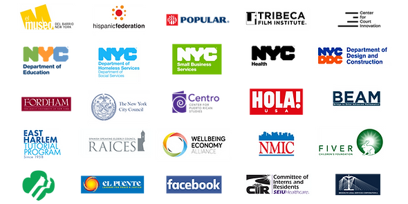
use a logo grid to feature past clients
-
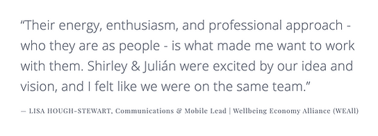
direct quotes from clients as testimonials
-
expanded bios for the creative team
-
update content to show range
-
copy to indicate added service value, like project management
-
feature portfolio content in a way speaks to B2B2C goals
DESIGNING
A SOLUTION
STRENGTHENING THE NARRATIVE:
HOSTING A "UVP" DESIGN STUDIO
As a way to do some rapid creative brainstorming and encourage buy-in, I led a remote design studio with stakeholders to generate words and phrases for the site's UVP for the homepage.
To help with brand positioning, I asked questions that were similar to earlier in the process, like "What do you make?" and "What is the purpose of your work?"

The results of the studio were effective in 3 key ways:
-
I wrote a UVP that spoke to the B2B2C audience
-
I did it using language that resonated with stakeholders
-
Bonus = "leftover" vocabulary was used in section titles!
STRENGTHENING THE NARRATIVE:
COPYWRITING & VISUAL IMAGERY
I knew that strengthening the narrative of the brand and improving clarity and understanding was going to require clean, energetic styling and several different types of copy in the redesign.
I used a combination of creative, persuasive, and functional writing to draft a UVP, header and section titles, body copy, and labeling for portfolio pieces, returning to stakeholders with questions when I needed more detail for bios and portfolio assets.
.png)
"About" - ORIGINAL COPY
In the original, users needed to weed through dense text and lists to learn more about the company, creative team, and past clients.

"About" - NEW COPY + VISUALS
New copy introduces readers to the brand on the homepage in 4 short sections divided by white space, an vibrant image chosen to reflect the brand's connection to their community, and an attention-grabbing logo grid to feature past clients.
Each section is titled with copy written to help the reader understand what kind of information to expect in the body copy.
Body copy emphasizes clear and concise details on what the business does, services, and a bit about their creative process and approach.

Team Bios - ORIGINAL COPY + VISUALS
In the original bio, users get a general sense of the creative team's values, but offers little credibility on their background or expertise. The headshot is cropped and stylized in a way that confused users and undermined their trust during early usability testing.

Team Bios - NEW COPY + VISUALS
The separate bio page uses current, professional headshots and provide details on the creative team by expanding on their roles, strengths and industry history, quantifying experience, referencing awards and achievements, and emphasizing their community values.
STRENGTHENING THE NARRATIVE:
TESTIMONIALS = TRUST
Adding testimonial to the new site gives users direct insight on what working with the brand is like, and helps build confidence and trust.
STRENGTHENING THE NARRATIVE:
NAVIGATION, CONTENT HIERARCHY, & LABELS
To keep mental processing order consistent for the user, I set the hierarchy of the homepage sections and related CTAs buttons to appear on scroll in the same order as the primary navigation.

The original site was built as a single page; primary navigation tabs functioned as anchors for the various sections of the page. A UVP-style message blocking the hero video is hard to read and doesn't help provide context.
The redesigned site uses navigation and CTAs to link to different pages. The UVP is large, easy to read, and located directly under the hero video it supports.
The homepage introduces the brand by section, giving the user clear expectations on what they will find on the rest of the site, and revealing information in order from broad to granular.
.png)
Homepage - BEFORE

Homepage - AFTER
The original site's portfolio section lacked labeling, making it impossible for users to know what they were looking at.
.png)
Video Page - ORIGINAL
The redesign grouped and titled videos by the purpose they fulfilled for the organization.
Individual videos are labeled first by by the organization name, and then by the campaign title for the project.

Video Page - NEW
STRENGTHENING THE NARRATIVE:
SETTING A STYLE & FEEL
I chose a new color palette and typeface for stakeholders, based on their feedback that they wanted a serif font for headings, and brand colors that resembled "sun & sky".

Playfair Display
Open Sans
For headers, titles, and labels, I chose Playfair Display Bold - a polished, upbeat typeface that stands out and is easy to read at heavier weights and large sizes.
For body copy, I chose Open Sans Regular, a san-serif typeface that is easy to read at smaller sizes and when there is more text present.
I set the color palette to have high enough contrast to meet the minimum accessibility ratio (4.5:1), using Sunray as a vibrant primary color for CTAS and infographics.
STRENGTHENING THE NARRATIVE:
SQUARE SPACE CONSTRAINTS
Although Square Space templates all come with a pre-set layout, I deleted all of the demo template blocks and started from scratch to customize the new site.
Templates also come with pre-set options for customizing styling, so if you want specific customization that isn't offered within the template, it requires a bit of coding:
I found the pre-set hover interaction for CTA buttons was too low-contrast for a user to really notice, so I added custom CSS to change the hover color from light yellow to black.

FINAL DESIGN PREVIEW
Watch a short intro to the site below, or visit the live site here.
NEXT STEPS
After launching the redesigned desktop site in August 2020, I plan to explore the following next steps:
MUST HAVE
-
Monitor KPIS reguarly: check data on site traffic and # of new leads on a quarterly basis over the next 12 months.
NICE TO HAVE
-
Add a "Reviews" page to the site and integrate Trust Pilot or a similar service as a method of collecting more extensive client reviews; add CTA to the testimonials section on the homepage to direct traffic to the page.