

UX DESIGNER
Zip Pals - UXDI Bootcamp Project
Social App Concept Design
Winter 2020
ROleS
UX Researcher
UX/UI Designer
Scrum Master
UX TEAM
Molly Winter Stewart
Victoria Qian
Greg Starr
Hanna Chumakova
TIMELINE
2 week Agile sprint
METHODS
Topic Map, Opportunity Matrix, Survey, User Interviews, Affinity Mapping, Persona, Journey Map, Moscow Method, Design Studio, Sketches, Wireframes, Mockups & Prototype, App Flows, Usability Testing, Style Guide & Spec Doc*
*Available to view upon request
TOOLS
Figma, Zoom
SUMMARY
Zip Pals is a concept design for an iOS social app that helps city-dwellers meet and make meaningful connections with their neighbors so they can enjoy local experiences together.
The app is designed to help users connect online based on shared interests and zip code, and then meet offline for activities and events that reflect their shared interests, and are located within nearby zip codes.
My biggest takeaway from working through iterations of this design was the importance of simplifying visuals and interactions throughout the flow of the application, to provide a more intuitive, clear, and satisfying experience for the user.

TRYING TO Understand
the problem space
ExplorinG OPPORTUNITIES CONNECTED TO URBAN LIVING
My design team decided to explore problem spaces we felt were common for people living in an urban area. We drew out related ideas using a topic map, branching out until we could see an opportunity to explore based on the assumption that meeting new friends in urban areas can be challenging:
It can be difficult to meet people and build new friendships in urban areas and dense cities, because users often feel isolated and disconnected in their local neighborhood.
Urban / City Life
neighborhoods
disconnected
meeting new friends?
WHAT COMES FIRST: the ACTIVITY...
...OR THE USER?
To understand where we might fit in the market of "meeting new friends", we created a competitor matrix to evaluate a range of social-media brands that can potentially result in offline user interactions. For each brand, we analyzed the type of relationship they promote, and what factor is the primary driver for the app: an activity, or user connections.

Market Matrix for Social Media Apps
KEY TAKEAWAYS ABOUT THE PROBLEM SPACE

Even though the social media app is saturated, exploring it more deeply proved that there was room in the market to explore a concept that puts user connections first in the interest of online-to-offline friendship. The next step in generative research was to find and interview people to interview in urban areas as a method of learning about their needs and pain points in making new friends.
TRYING TO Understand
THE USER
INTERVIEW CRITERIA
We set criteria and conducted a survey to make sure we found interview candidates who represented a balanced demographic of post-collegiate adults living in a range of urban locations.
LOCATION: Must live in an urban area.
We sourced a range of urban locations across the United States to ensure we were drawing insights from a balanced pool of city-dwellers.
CONTEXT: No students. This eliminated the context of school as a meeting place, and still captured a broad range of adults.
INTEREST: Must have an interest in meeting new friends locally - because that's the intention behind the problem space we wanted to learn more about.
FOCUSING OUR INTERVIEW TOPICS:
HOW DO YOU MAKE FRIENDS LOCALLY?
To understand the needs, pain points, goals and behaviors of users, we tailored our interview questions to focus on the following topics:
apps & services currently used
experience of make new friends as an adult
relationships with neighbors & neighborhood
methods of finding local events
KEY TAKEAWAYS ABOUT THE USER
1
users want to feel safe when they take an online connection offline to meet IRL
USER SAFETY
2
users believe meaningful friendships are rooted in
shared values & interests
Friends share values & interests
3
users are busy and don't want to travel far to meet someone
LIMIT DISTANCE
4
users need a place to meet new people where they feel comfortable
FRIENDLY LOCATION
These 4 insights lead to a clear PROBLEM STATEMENT,
and drove the 4 FEATURES we chose to develop.
CRAFTING A CLEAR pROBLEM STATEMENT
How might we help users find and meet new people in their local neighborhood who share their values & interests, and improve the likelihood of them establishing a meaningful friendship?
DESIGNING A SOLUTION
FEATURE PRIORITIZATION
Insights from our user interviews resulted in our decision to prioritize the following features during our design sprint, which we iterated on in all fidelities.
1
ONBOARDING WITH SECURITY VERIFICATION
2
USER PROFILE BUILDER
3
SEARCH & VIEW USERS BY ZIP CODE
4
IN-MESSAGE ACTIVITY GENERATOR
WIREFRAMES & MOCKUPS:
ITERATING FOR SIMPLICITy & UNDERSTANDING

Overall mid-fidelity design iterations were based on usability test feedback that indicated a need to simplify how users interacted with the app by improving communication, providing more intuitive interactions, and increasing cognitive understanding as users navigated through features in the flow.
In Onboarding, this was accomplished by adding content.
In the Profile Builder, Search/View Users, and In-Message Activity Generator, this was accomplished by eliminating complex content & unnecessary visual elements, including screens, icons, and buttons.
1
ONBOARDING WITH SECURITY VERIFICATION
(2-Screen FLOW)


1
2
Mid-Fi V.1
Mid-Fi V.3
.png)
2
Hi-Fi Mockup
1
Mid-Fi v1: Usability testing of this design showed that users wanted to see detailed information about the app first, before verifying credentials with a photo ID scan.
2
2
Mid-Fi v3 & Hi-Fi Mockup: Welcome and ID Verification screens are switched in the flow, expanded details are added on both of the screens to improve understanding, communicate brand trustworthiness, and communicate expected feature functionality to new users.
2
DETAILED
USER PROFILE
USER PROFILE BUILDER


1
2
2
Mid-Fi V.1
Mid-Fi V.3
Hi-Fi Mockup
1
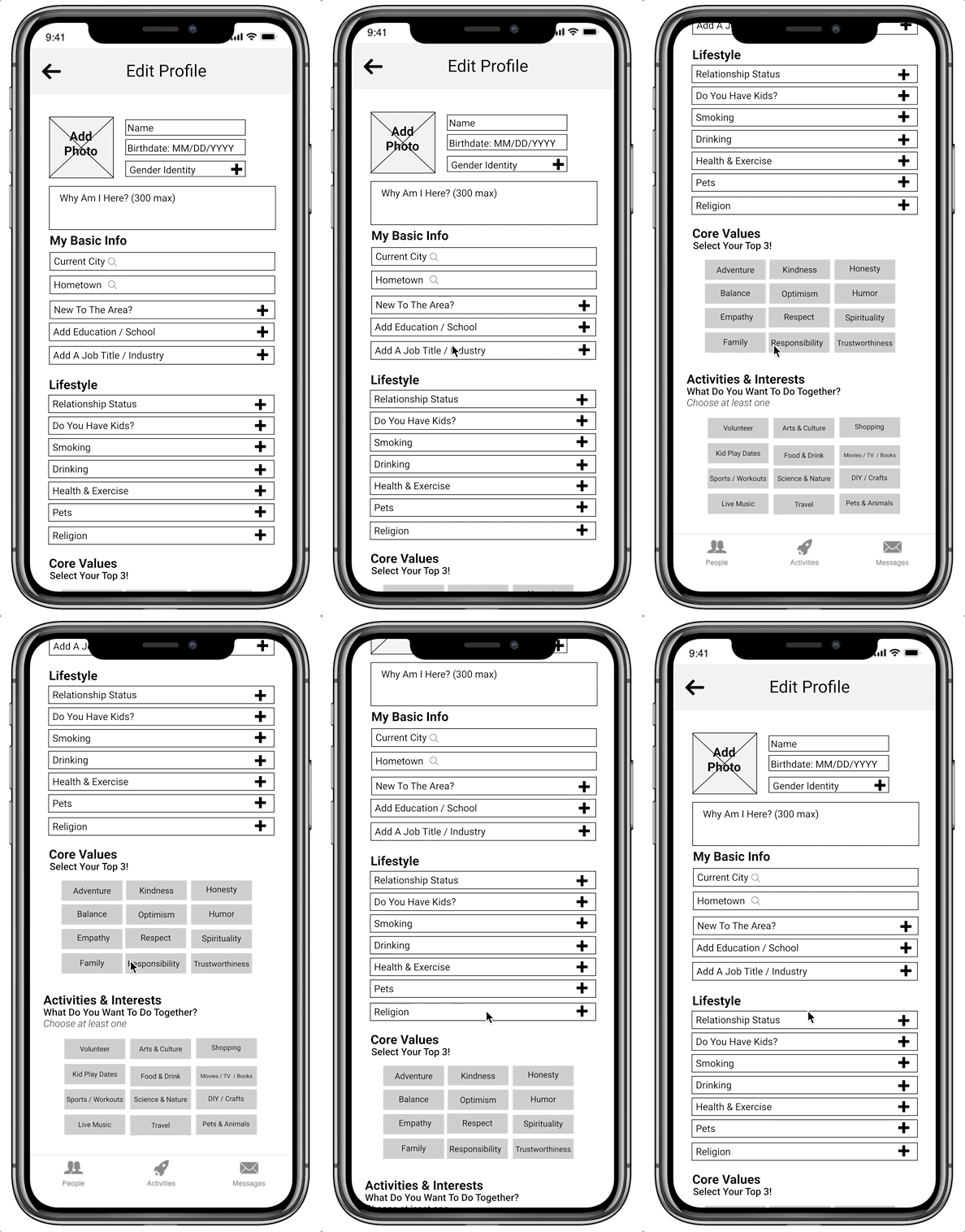
Mid-Fi v1: User interviews had indicated that users wanted to make connections based on shared values and interests; however, when we included sections for users to mark their values in the original mid-fi Profile, usability tests showed that users felt the opposite: they were not comfortable sharing their values on a "friendship app".
2
Mid-Fi v3 & Hi-Fi Mockup: Based on these test results, we eliminated the Values / Lifestyle section, leaving only "Activities & Interests", which also reduced visual & interactive overwhelm.
3
SEARCH & VIEW USERS BY ZIP CODE


2

1
3
Mid-Fi V.1
Mid-Fi V.2
Hi-Fi Mockup
1
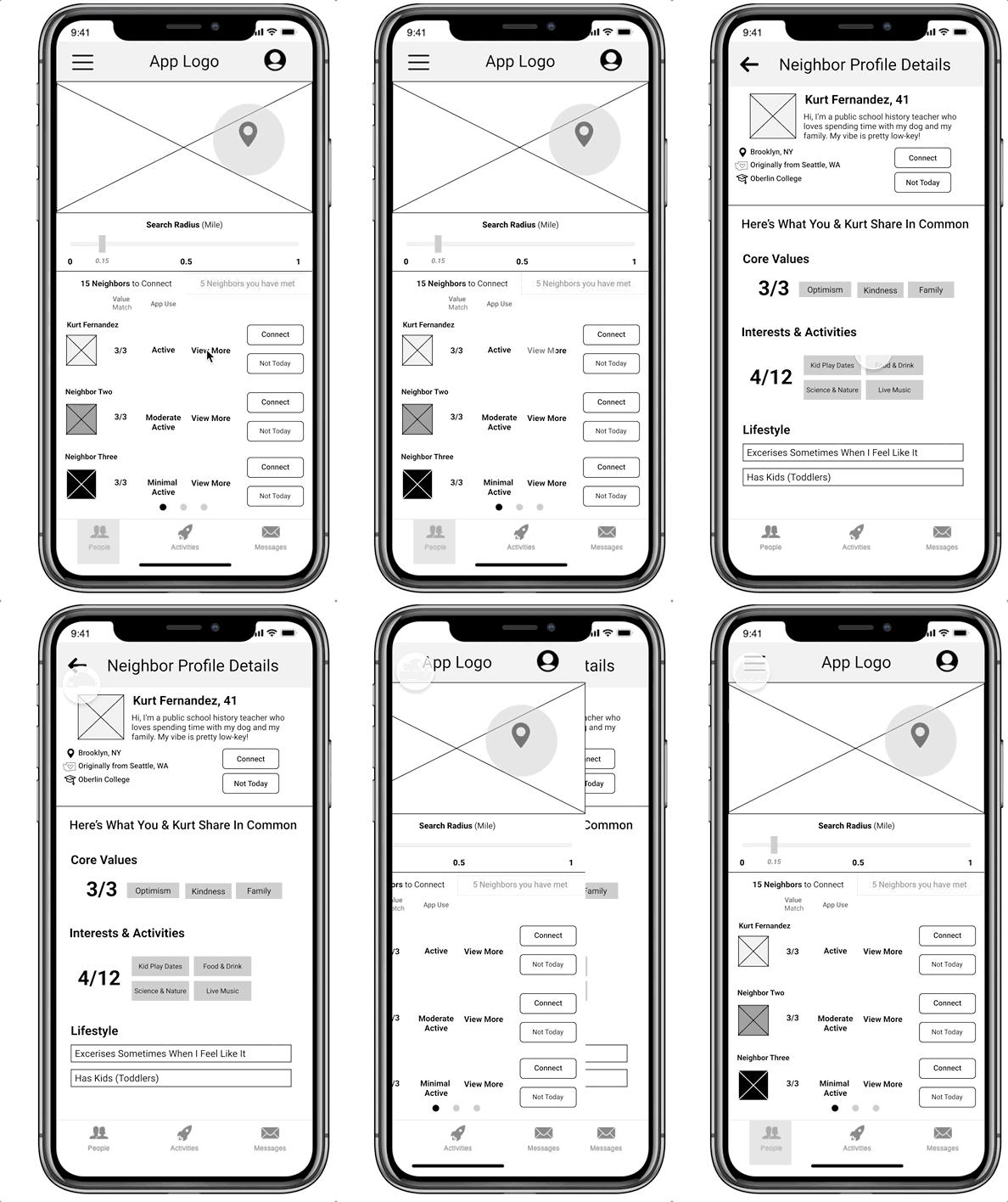
Mid-Fi v1: When viewing neighbor matches and individual profile details, our first usability test showed that users felt the screen was too busy, and images were too small. They wanted to see larger images on the "Neighbor Matches" screen, less text, and fewer CTAS.
Mid-Fi v2: We integrated these changes into our next iteration; however, testing here showed that users felt the Profile Details modal content was visually clean but too small. They did not understand which elements on the modal were interactive, what response to expect from the friend-request CTA based on the word "Connect", or why it was located on the main Neighbor Matches screen instead of the profile modal. Lastly, they felt that showing a user's last name was unnecessary for privacy & security.
2
3
Hi-Fi Mockup: More white space gives the Neighbor Matches screen more breathing room by using the full-width of mobile to show single, vertically-stacked profiles. We also re-integrated the Profile Details to a full-size screen, and moved the friend-request CTA to the Profile Details screen, re-labeling it "Send Request".
4
IN-MESSAGE ACTIVITY GENERATOR
Mid-Fi V.1

1
Mid-Fi V.2
Hi-Fi Mockup

2
2

3
1
Mid-Fi v1: The Activity Generator existed as a separate screen with a dedicated navigation tab, but testing showed that the feature's location confused users, and that the connection between activities and other users was unclear.
2
Mid-Fi v2: The Generator feature was relocated to User Messaging, and interactive buttons labeled with both users shared interests were added under the recipient's name to auto-populate local activities within the message stream when tapped. Testing showed that re-locating this feature to within Messaging was appealing to users, but the functional purpose and location of the buttons was not clear.
3
Hi-Fi Mockup: The Generator stayed within the in-app messaging, but it's location is revealed through a ferris wheel icon at the top right corner of the screen, which triggered a modal when tapped, showing the viewer a selection of auto-generated activities to choose from that both users would enjoy. This helped keep the Generator separate visually, but still allow for users to access the feature in messages.

With so many changes made to each of the 4 features based on user feedback during mid-fidelity usability testing, it also became necessary to change the tab navigation as a by-product.
Mid-Fi V.1
Mid-Fi V.2
Mid-Fi V.3
Hi-Fi Mockup


TRY THE PROTOTYPE
To see how all of these features work together to help urban users find and meet new friends in their zip code, watch a short click-through of the Figma prototype, or try it for yourself!

NEXT STEPS
EXPLORE PARTNERSHIP OPPORTUNITIES

To help gain traction with the app and interest in a future purchase, I would continue to explore possible brand partnerships. As a social app that is designed to help people connect and engage in local activities, Yelp stood out as a possible partner for the following reasons:
-
Zip Pals is user-first, activity second. Users can get to know each other a bit first before deciding to meet for an activity.
-
Yelp has a large user base, but an under-utilized local events feature. Yelp users can express interest in an event, but there isn't a way to book or purchase tickets through the app, or connect with people who might be going
-
The Zip Pal Activity Generator connects users to local events that could be sourced by Yelp. In turn, Zip Pals users could provide feedback and reviews on whether the event was good for meeting a new friend: safety, location, and general comfort.
-
Our partnership would rely on Yelp investing in a feature integration to give users the ability to book & purchase tickets for activities through the Zip Pals app.
REFINE THE PROTOTYPE
Continue refining and testing the prototype, to make sure the flow is optimized for usability, understanding, and user satisfaction.
TEST THE MARKET
Beta test the app in major market cities for feedback (NYC, SF, Philly, Chicago)
EXPLORE ADDITIONAL MARKETS
Research viable expansion opportunities in different geographical locations (suburban, small towns, rural), and produce concept designs for testing.